

Components of the Interactive Data Visualization
For optimal functionality, data visualizations are best viewed on a desktop device.
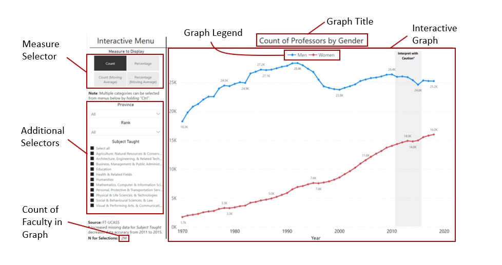
The interactive data visualizations follow a standard format. An interactive graph is always shown on the right and automatically updates as new selections are made. Users can “mouse over” parts of the graph to display popup boxes with more detailed information. The visualization can be expanded to fill the entire screen by clicking the “Full-screen Mode” button on the far right of the tool bar, below the graph. This may be especially useful for those having difficulty reading the text or viewing the graphics on their device.
The interactive menu is on the left side and is composed of two major sections: “Measure to Display” and “Filters.” Using the “Measure to Display” selector, the reader can switch between displaying counts and percentages in the graph. Additionally, the trends in the graph can be smoothed using three-year moving averages by selecting the “Moving Average” option. This is useful when examining trends for small subgroups that exhibit strong random fluctuations over time.
Below the “Measure to Display” selectors are “Filters,” which allow the reader to filter or restrict the types of data shown in the graph. For example, using the Province submenu, data in the graph can be restricted to show faculty from any single province, any combination of provinces together, or all provinces in Canada. Hold “Ctrl” on your keyboard while choosing in order to select multiple checkboxes.
Results are suppressed in the graphs in a few instances. Some data points are suppressed by Statistics Canada to protect the confidentiality of respondents in the FT-UCASS data extract and will not show up in any displays. Additionally, to prevent misinterpretations of trends due to random fluctuations, all data points are hidden when the total number of faculty for the graph is less than 400. The “N for selections” line, in the bottom left of each visualization, displays this value and updates as different selections are made from the interactive menu. Yearly percentages are also hidden when they represent less than 40 total cases.